Reviewshake

Web App, SaaS App Redesign
UI and UX enhancements
Role & duration
Product Designer. Reviewshake Inc.,
Sep 2023 - Jun 2025
Main markets:
North America & Europe
Team:
VP of Product
Product Designer
4+ Developers
Overview
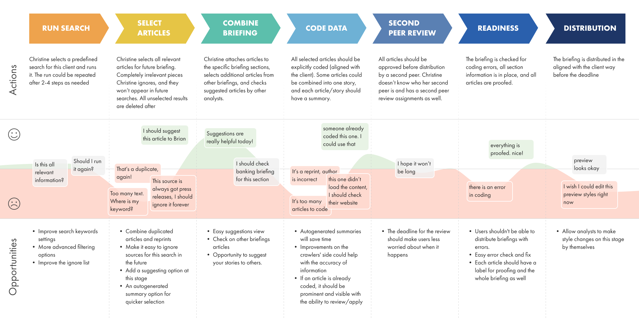
Reviewshake application is a SaaS web application for companies that want to monitor their customers’ reviews online across multiple platforms in one app.
The application received its first and last design input over 8 years ago, and since then, new features have been added without proper UX research, being introduced sporadically throughout the application. As a result, many users become confused and redundant. Customer success research has shown that only expert users can figure things out, while new users only use basic features or cancel their subscription.
My Role
As a Product Designer, I analyzed the current app’s structure, created a detailed features workflow, analyzed Customer Success’s report of users' features use. Then I created a detailed plan of the app’s step-by-step redesign approach, with design and development stages to make sure we could make a smooth experiense for the current users.
The first stage was to redesigned the menu panel with a new branding style and new UX approach.
The second stage - I created a new Onboarding flow, tested it out and ran it into development. Conducted design supervision post-development on each stage.
Applied skills:
User Interviews
User Flows
User Journey
User Persona
User Survey Creation
Design Thinking
Usability Testing
Visual Design
Rapid Prototyping
Clickable Prototyping
Lo-Fi Wireframes
Hi-Fi Wireframes with Design System Implementation
Future opportunities analysis
Discovery Process
I collected ideas from the analytics team regarding the features they want to add to the current app. I also invested time in becoming proficient with the existing app. Through learning and regular usage, I gained a deep understanding of the app's functionalities, which further informed my analysis and helped me identify potential areas for improvement.
Through stakeholder interviews, I identified pain points in the current app and critical moments in the user journey. To further improve our understanding, I also interviewed users and learned about their daily app usage process, pain points, and potential areas for enhancement.
User Persona
After analyzing the collected data, a user persona was crafted to represent the target audience. This persona serves as a fictional character that embodies the intended users' key characteristics, behaviors, and needs.
User Journey
I created the user journey to map out the user's steps and touchpoints while interacting with the tool, from initial discovery to achieving their end goal. Because this is an internal tool and users have no other option than use it, I focused on the user journey inside the tool and discarded all outside interactions.
By understanding the user journey, it was easier to identify areas for improvement and optimization.
Assumptions
Initially, I cut any elements that appeared superfluous and streamlined intricate interactions to their fundamental components. The objective was to evaluate the value and substitutability of distinct features since various users emphasized varying usage levels and importance in the discovery phase.
Goal: fail fast, succeed faster
First User flow and lo-fi prototype
With that assumption in mind, I developed a straightforward user flow for the upcoming application, considering the expected user journey and desired outcomes.
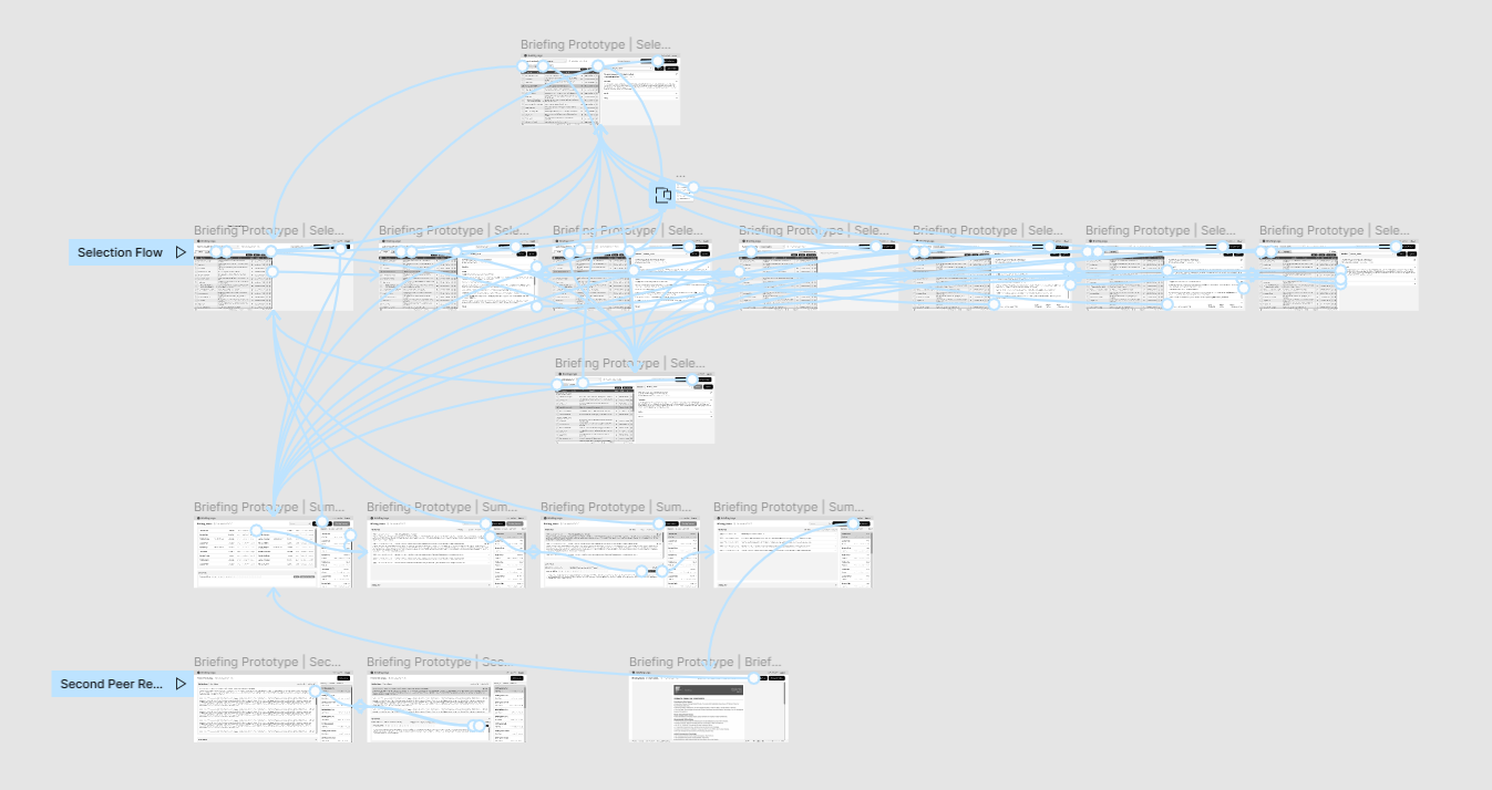
I started rapid prototyping to transform the conceptual user flow into a testable representation. Beginning with a basic layout, I focused on capturing the application's core functionalities and visual elements. This initial prototype served as a foundation for further design iterations and refinement.
During a collaborative discussion with the product manager, we agreed that the prototype should go beyond a static representation and include interactive elements. By incorporating interactions, such as clickable buttons and simulated transitions between screens, we aimed to provide a more immersive experience during user testing.

User interviews
After completing the interactive prototype, we immediately conducted user interviews. The app is used only internally, so we had direct access to the actual users and made it our benefit.
We used a clickable prototype during interviews to see users' actions in real time and gain insight into their needs and demands. We also asked targeted questions to understand the users’ preferences, challenges, and workflow issues, which helped us better understand their perspective.
Their perspectives also provided valuable insights, allowing us to identify new feature ideas and improvement opportunities.
The user interviews served as a critical feedback loop, enabling us to start a new discovery-design-test iteration based on user insights.
Second design iteration
Based on the insights from the user interviews, I improved the workflow and presented new entities and features to accomplish user goals more simply and efficiently. The following workflow review showed positive feedback on my idea, and I created a new version of the interactive prototype to discover additional details and gain more feedback.
After the second version of the prototype was complete, we moved to the user interviews again.


High-fidelity wireframes
The results of the second round of user interviews with users and stakeholders showed positive feedback on the new suggested workflow. Users were quite excited about how fast they could create a briefing and how unnecessary steps were successfully avoided.
Considering the feedback from the second review round, I moved to the app's UI. I implemented the company's current style into the new interface to make the redesigned app cohesive with all other company products (which were also in the redesign process).
-
![]()
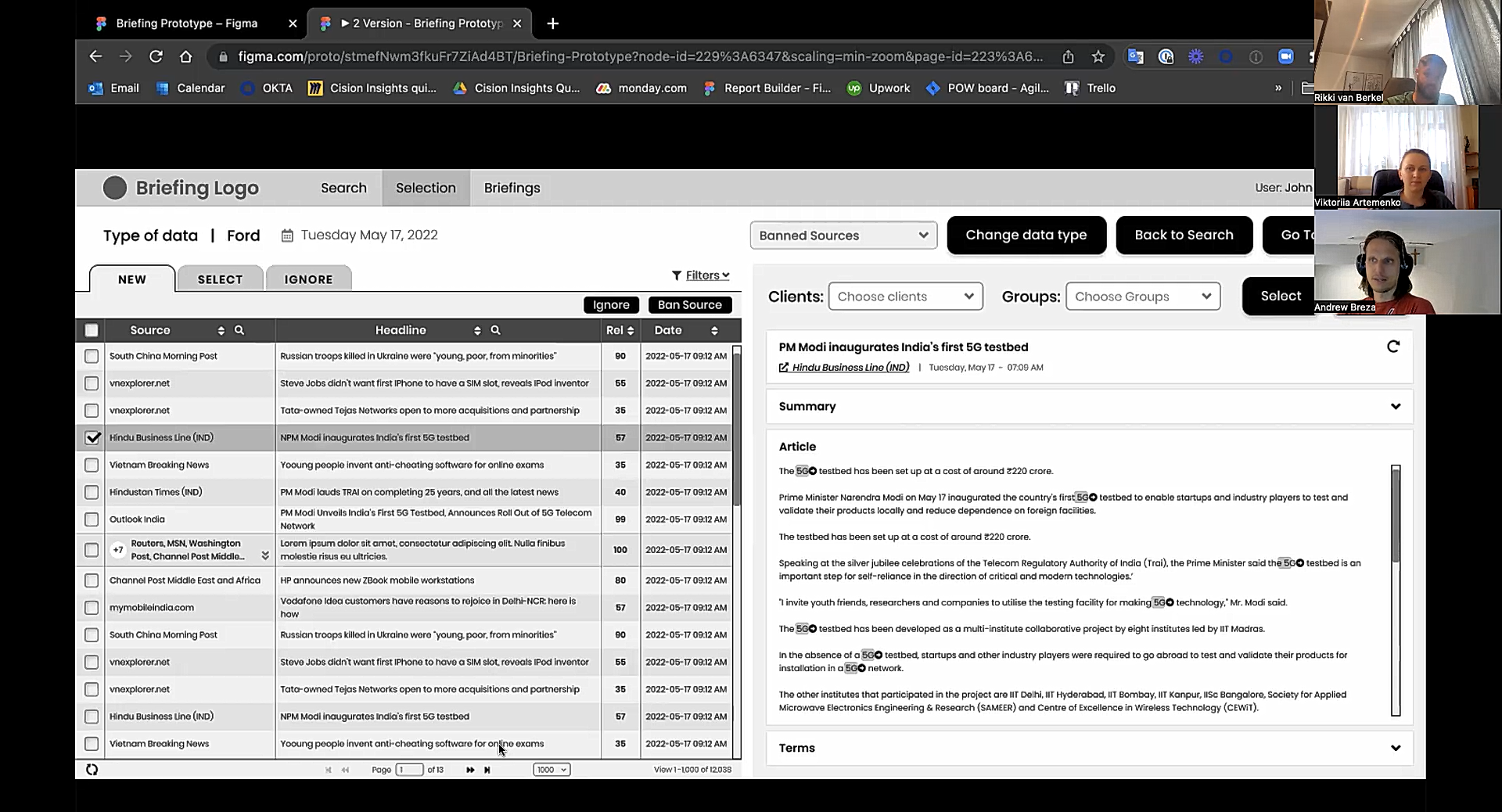
Selection of new articles screen
-
![]()
Changing article category in selected articles
-
![]()
Articles filters
-
![]()
Compiling briefing
-
![]()
Drag-n-drop articles into the briefing
-
![]()
Briefing summary editor
-
![]()
Editing summary’s content
-
![]()
Articles already coded by other analysts
-
![]()
Error panel


User-testing
At this stage, I’ve worked with the UX researcher to create an automated user test to test the web app on a large group of users. We used the Maze tool to create a user test, implemented a clickable prototype inside the user test, and made a list of questions for additional surveys.
In the user tests, users were supposed to:
to go through a prototype to discover all the features by themselves
complete several direct tasks with the prototype and leave feedback about them
answer quick questions about the features
leave an open overall feedback
The overall time of the test completion was around 15 minutes.
Outcomes
The user tests gave important feedback and highlighted a few spots for additional improvements. Overall, the new revised workflow and design were met with great warmth and excitement from the user side. They were thrilled with the simplified workflow and new AI features.
The new simplified flow opened new opportunities for faster training of new employees and creating briefings. Also, the simplified structure and new AI features showed the marketing team opportunities to train clients to create briefings directly without including internal employees.
Next Steps
Upon concluding the design process, the client opted to form a dedicated team to continue developing the project in the future. As part of this initiative, I facilitated workshops with the newly formed team to make sure they fully understood the new workflow and complex background processes following it. The back-end phase of the project was moving forward to implement the app in the real world.